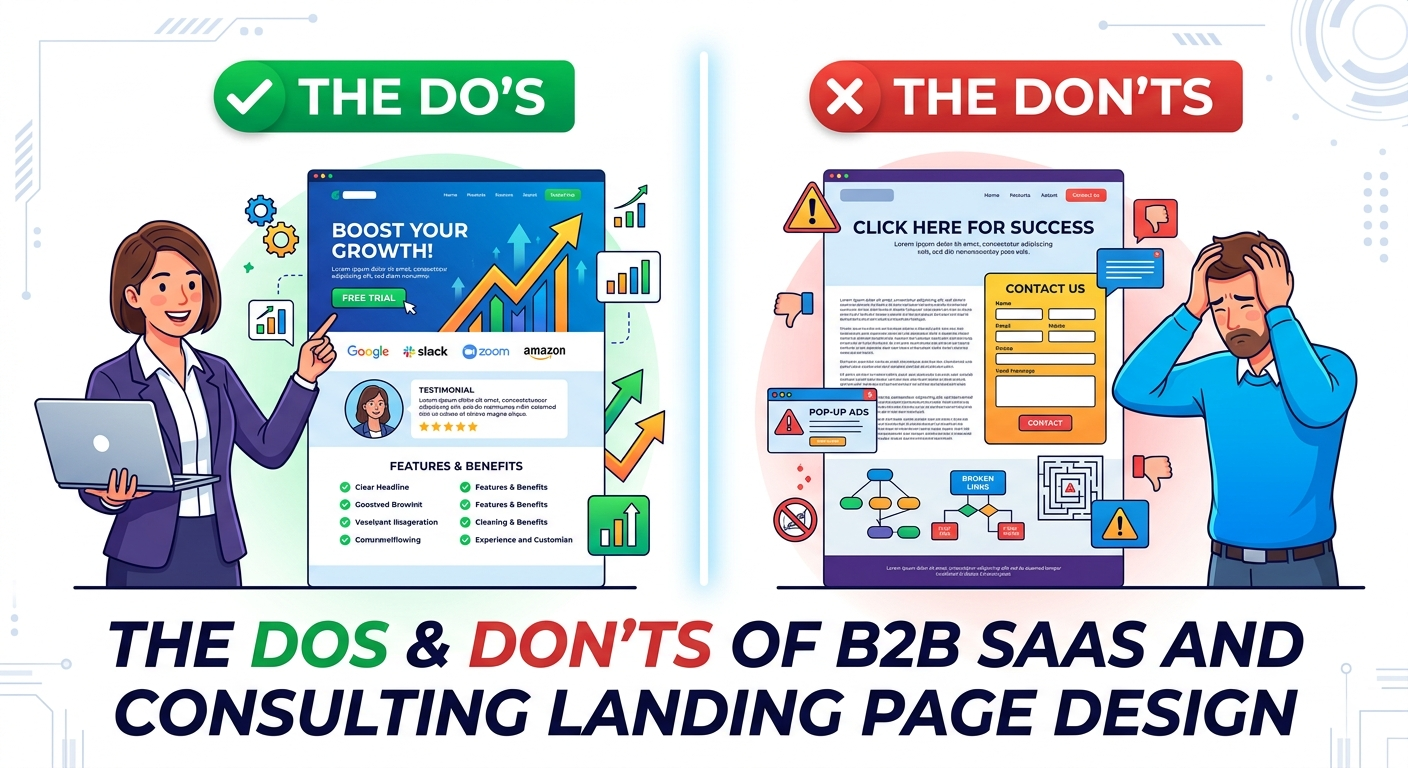
Your landing page is not a digital brochure. In B2B SaaS and consulting, it is a silent salesperson working around the clock, and it has about eight seconds to convince a skeptical buyer that your solution is worth their time. Enterprise buyers do not impulse-click. They evaluate, compare, and circulate links among stakeholders before anyone fills out a form. Your landing page must earn trust at every scroll, remove friction at every interaction, and guide visitors toward a clear next step without ever feeling pushy.
Do Lead With the Outcome, Not the Feature
The most common mistake on B2B landing pages is opening with a headline about what the product does instead of what the customer gains. “AI-Powered Workflow Automation Platform” tells the visitor nothing about why they should care. “Reduce Your Month-End Close from Five Days to One” speaks directly to a pain point that keeps CFOs awake at night.Your headline and subheadline should answer three questions in ten seconds: Who is this for? What problem does it solve? What is the measurable outcome? If your visitor cannot articulate those three things immediately, they will bounce. Lead with the transformation. Let the features live further down the page where interested buyers are ready to evaluate capabilities.
Don’t Drown Visitors in Jargon
B2B marketers sometimes confuse sophistication with complexity. They load headlines with industry buzzwords, acronym-heavy descriptions, and vague abstractions like “synergistic digital transformation solutions.” This does not signal expertise. It signals that you are either hiding something or you do not understand your customer well enough to speak their language.Write your copy as if you are explaining your value proposition to a smart colleague who is not an expert in your domain. Use the exact language your customers use in sales calls and support tickets. If a phrase requires a second read to understand, rewrite it. Clarity is a competitive advantage in B2B because most of your competitors are still writing like they are trying to impress investors rather than help buyers.
Do Design for the Skeptical Scroller
B2B buyers scroll with their guard up. They are looking for reasons to disqualify you so they can move on to the next option. Your landing page must address objections in the order they arise. Start with the outcome, then immediately answer “Why should I believe you?” with social proof. Follow with how it works, then address specific concerns like security, implementation timelines, and integration complexity. End with a low-friction conversion path.This narrative arc mirrors the internal conversation happening in the buyer’s head. They do not want to hunt for your security certifications or wonder if you serve companies their size. Anticipate the skepticism and resolve it before they have to ask.
Don’t Ask for the Marriage on the First Date
Nothing kills B2B landing page conversion faster than a form that asks for too much, too soon. If your primary call-to-action is a demo request, do not demand company size, annual revenue, job title, team size, budget range, and a detailed project description before the visitor has spoken to a human. Each additional field drops your conversion rate, and in high-value B2B sectors, that drop represents serious pipeline loss.
Match your ask to the stage of trust. A first-time visitor who clicked a LinkedIn ad is not ready to commit to a forty-five-minute sales call. They might be ready to download a one-page case study or take a two-minute assessment. Use progressive profiling. Capture an email first, then build the relationship through valuable follow-up before requesting deeper qualification data.
Do Make Social Proof Specific and Credible
Generic social proof is worse than no social proof at all. “Trusted by thousands of companies” means nothing to an enterprise buyer. “Reduced procurement cycle time by 34% for a Series C fintech company with 400 employees” means everything. Use logos, yes, but pair them with specific outcomes. Use testimonials, but make them detailed enough that they sound like they came from a real person describing a real situation, not a marketing team writing aspirational fiction.
Case study snippets work exceptionally well on landing pages because they combine credibility with narrative. A two-sentence quote from a VP of Engineering about how your consulting team untangled their legacy architecture in six weeks is more persuasive than a five-star rating from an anonymous user.
Don’t Neglect the Post-Conversion Experience
The landing page does not end at the thank-you message. What happens after someone fills out your form or clicks your button is part of the design. If you promise a whitepaper, deliver it instantly via email with a clean, mobile-friendly PDF. If they booked a demo, send a calendar invite within sixty seconds and include a brief agenda. If they signed up for a trial, drop them into an experience that delivers value in the first five minutes, not an empty dashboard with a twenty-step onboarding wizard.
A broken post-conversion experience destroys the trust your landing page just built. B2B buyers notice these details because they are evaluating whether your company can deliver on promises. If your automated email is sloppy, they will assume your implementation process is too.
Do Optimize for Mobile Without Dumbing Down Desktop
B2B buyers absolutely use mobile devices. They check your landing page between meetings, forward links from their phones, and review proposals on tablets during commutes. Your mobile experience cannot be an afterthought. But mobile optimization does not mean stripping away content. It means restructuring the same information for smaller screens with larger touch targets, readable font sizes, and forms that do not require pinch-zooming to complete.
Test your landing page on actual devices, not just browser emulators. Make sure your primary CTA is thumb-reachable. Ensure your value proposition is visible without scrolling. And never, under any circumstances, use interstitial pop-ups on mobile that are impossible to close without accidentally clicking through.
Don’t Rely on a Single Conversion Path
Not every visitor lands on your page with the same intent. Some are in early research mode. Some are comparing you against two competitors. Some are ready to talk to sales today. If your only call-to-action is “Request a Demo,” you are telling the researcher and the comparer to leave and come back later, which they probably will not do.Offer tiered next steps. A primary CTA for high-intent visitors, such as scheduling a consultation or starting a trial. A secondary CTA for mid-intent visitors, such as downloading a relevant guide or watching a recorded walkthrough. And a tertiary option for low-intent visitors, such as subscribing to a newsletter or following your company on LinkedIn. Capture people at their current stage of interest and nurture them forward.
Do Use Visual Hierarchy to Guide Attention
B2B landing pages often suffer from visual chaos. Too many colors, competing buttons, stock photography that adds nothing, and text blocks that bleed together. Your design should direct the eye deliberately. The headline should be the most prominent element. The primary CTA should stand out through contrast and whitespace. Supporting elements like feature lists, testimonials, and trust badges should recede until the visitor is ready for them.
Use whitespace aggressively. In B2B, whitespace signals confidence and professionalism. It says you do not need to shout to be heard. Keep your color palette restrained. One primary action color, one neutral text color, and one accent color maximum. Every visual element should earn its place by either explaining value or building trust. If a graphic does not do one of those two things, remove it.
Don’t Treat Your Landing Page as a Set-It-and-Forget-It Asset
The best B2B landing pages are living documents. They evolve based on real user behavior, not quarterly marketing calendar updates. Set up heat mapping and session recording to see where visitors actually scroll, where they hesitate, and where they drop off. Run A/B tests on headlines, CTA copy, form length, and social proof placement. Interview recent customers about what almost stopped them from converting and address that friction directly on the page.
A landing page that performed well six months ago may be underperforming today because your competitive landscape shifted, your traffic sources changed, or buyer expectations evolved. Continuous optimization is not a nice-to-have in B2B. It is essential because your cost per click is high, your sales cycle is long, and every percentage point of conversion improvement compounds into significant revenue over time.
B2B SaaS and consulting landing pages fail when they try to be everything to everyone, ask for too much too soon, or prioritize design awards over buyer clarity. They succeed when they respect the visitor’s intelligence, anticipate their objections, and make the next step feel obvious rather than obligatory.Design for trust. Write for clarity. Convert with patience. The companies that master those three principles do not just generate more leads. They generate the right leads, and they convert them into customers who stick around.