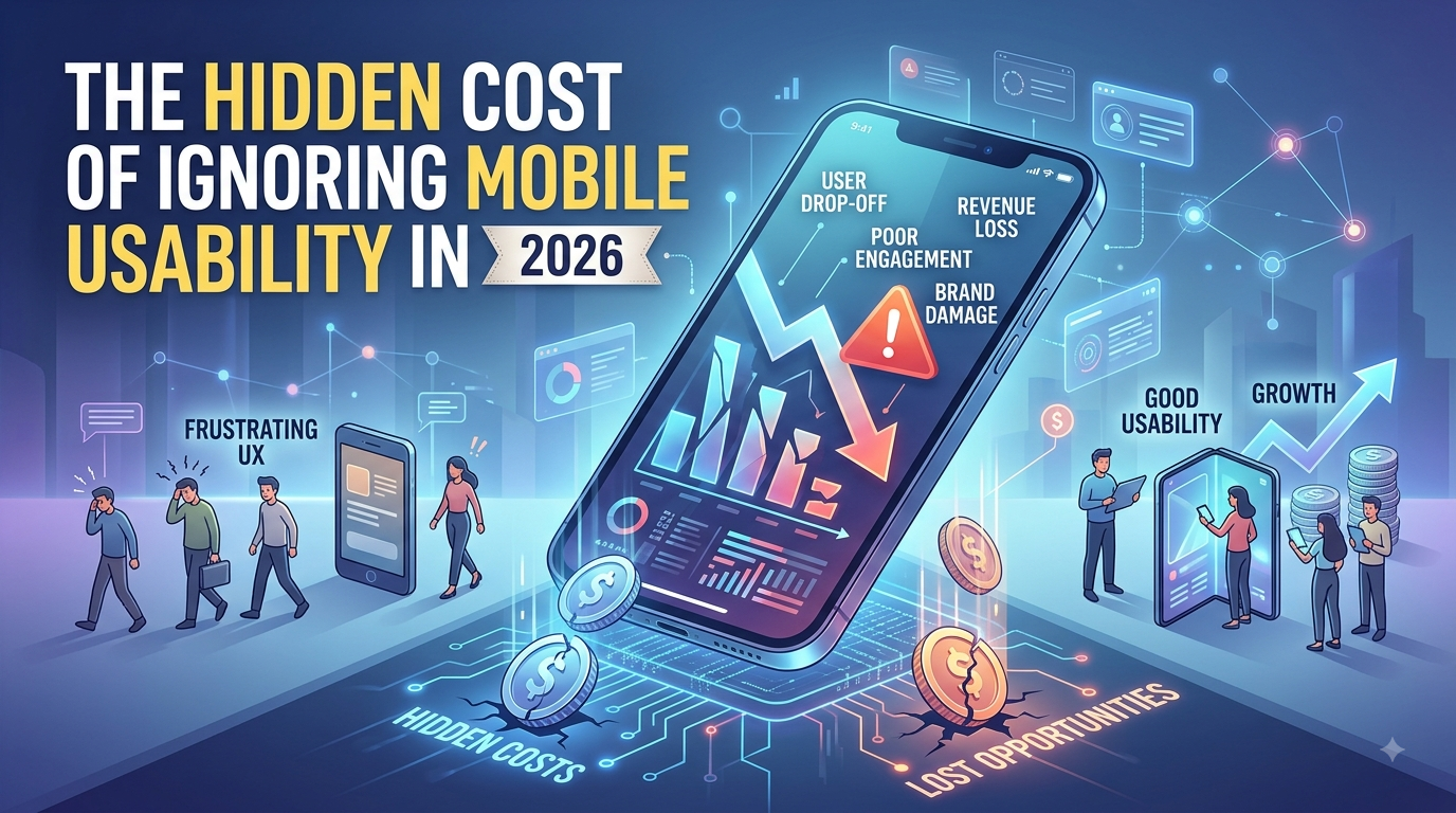
If you run a SaaS product or a small local business, there’s a good chance more than half your visitors are already arriving on a phone. And there’s a good chance you’ve never actually tested your site the way they experience it: one thumb, a cracked screen, spotty wifi, and zero patience for anything that doesn’t work on the first tap.
Mobile usability isn’t a design nicety anymore. It’s a revenue line item, and most businesses are bleeding money from it without ever seeing the number.
Mobile Isn’t the Future Anymore. It’s Already the Majority.
For years, “mobile-friendly” was treated as an add-on to the “real” desktop site. That thinking is now backwards. Across most industries, mobile devices account for well over half of all web traffic, and for many small businesses and SaaS landing pages, it’s closer to two-thirds. Your homepage, your pricing page, your signup form, your checkout flow: all of it is being judged primarily on a six-inch screen, whether you designed it that way or not.
When a business still tests only on desktop and treats mobile as an afterthought, it’s optimizing for the minority of its own visitors.
For SaaS Businesses, Mobile Friction Kills Trials Before They Start
SaaS companies live and die by signup conversion rates, and mobile usability problems hit that funnel especially hard because the stakes are so front-loaded. A prospective user who lands on your site from a LinkedIn ad or a Google search is making a split-second judgment about whether your product is worth their time. If the signup form is broken on mobile, if a dropdown menu doesn’t render properly, if the “Start Free Trial” button is hidden below a slow-loading hero video, that prospect doesn’t file a bug report. They just leave.
The damage compounds because SaaS trials are often the entire top of the funnel. A single broken mobile input field isn’t a small UX issue, it’s a leak at the very top of the pipeline that quietly reduces every number below it: trial signups, activation, and eventually paid conversions. Founders often spend heavily to drive traffic to that page and never realize a meaningful percentage of it never had a real chance to convert.
For Local and Small Businesses, It’s Even More Direct
A SaaS company loses a trial signup. A local business loses a phone call, a table reservation, or a walk-in customer who gave up trying to find your hours. Small business searches skew even more heavily mobile than SaaS searches do, because people are usually looking for something nearby, right now: a restaurant to book, a plumber to call, a store that’s still open. That’s an intent-heavy, impatient moment, and it has zero tolerance for a site that’s slow to load or hard to tap through.
A tiny “Call Now” button that’s nearly impossible to hit accurately, a menu page that requires pinching and zooming to read, a booking form that times out on a spotty connection: these aren’t cosmetic flaws. They are the exact moment a ready-to-buy customer decides to call the next business on the list instead.
The Cost Is Invisible Because It Never Shows Up as an Error
This is what makes mobile usability problems so dangerous: they rarely throw an error message or show up in an obvious way. Nobody gets an alert saying “23 potential customers gave up on your mobile checkout today.” The visitor simply leaves, and from the business owner’s side, it just looks like traffic that didn’t convert. Most people assume that’s a marketing problem, so they spend more on ads to drive more traffic into the same broken funnel, which only scales the loss.This is exactly the kind of issue a site audit is built to catch, because it requires actually testing the experience the way a real visitor would encounter it, rather than assuming the desktop version “basically” works everywhere.
What Good Mobile Usability Actually Looks Like in 2026
Good mobile usability isn’t about a page technically rendering on a small screen. It’s about whether someone can accomplish their goal with one thumb, on a real connection, without frustration. That means buttons and links sized for a fingertip rather than a mouse cursor, forms that use the right input types so a phone’s keyboard adapts automatically, pages that load quickly even on a weaker connection, and critical actions like “buy,” “book,” “call,” or “start trial” placed where they’re immediately visible rather than buried under a slow hero image.
For SaaS products specifically, it also means testing the actual signup and onboarding flow on a phone, not just the marketing homepage. That flow is often where the most expensive mobile usability failures hide, because it’s the part of the site most likely to have been designed and tested on a desktop screen by the product team.
Whether you’re running a SaaS platform trying to fill the top of your funnel or a local business trying to convert nearby searches into customers walking through the door, mobile usability failures cost you the same way: silently, continuously, and without ever showing up as a line item you can easily point to. The businesses that treat mobile as the primary experience rather than an afterthought are the ones keeping the customers everyone else is quietly losing. A proper site audit is often the only way to see exactly where that loss is happening, because it’s the one exercise built specifically to catch what a normal desktop review never will.