Posted on

A Beginner’s Guide to Topical Authority

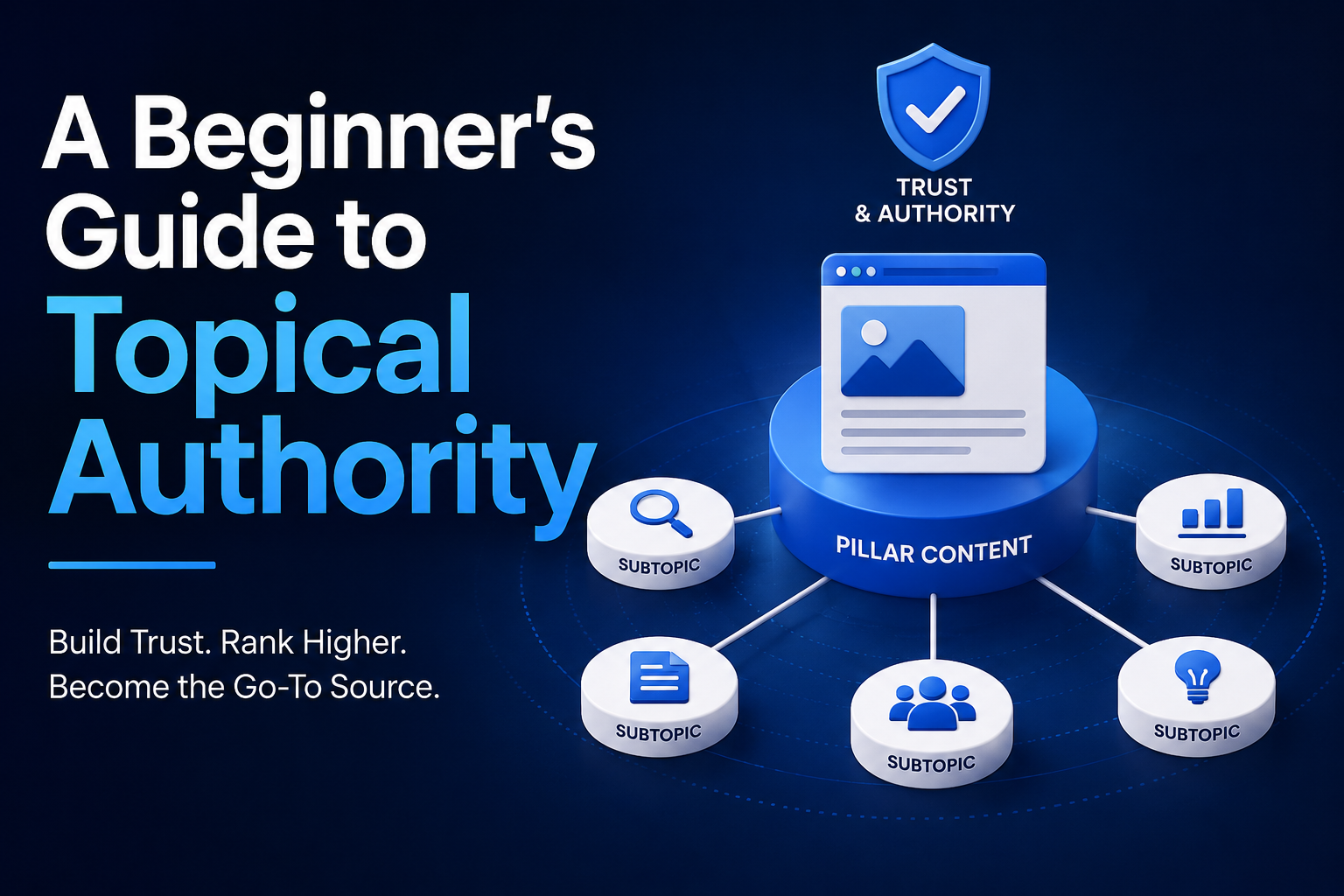
Topical authority is one of those SEO terms that gets used constantly without being defined clearly very often. It’s also, in a real sense, the underlying idea this entire series has been building toward from a different angle each time: clusters, pillar pages, internal linking, and site architecture are all, in practice, mechanisms for building topical authority. This post steps back and defines the concept directly, so the rest of the series has a clearer frame to sit inside.

What Topical Authority Actually Means

Topical authority describes how comprehensively and credibly a website covers a given subject, as judged by search engines based on the full body of content a site has published on that subject, not just the merits of any single page. A site that has published one excellent article about home coffee brewing has a good article. A site that has published thirty interconnected, well-organized articles covering brewing methods, equipment, technique, and troubleshooting has topical authority on coffee brewing, and search engines increasingly treat that difference as meaningful when deciding which site to rank for a given query.

The important distinction is that topical authority is a property of the site’s coverage as a whole, not of any individual post. This is why a single outstanding article sometimes struggles to outrank a merely decent article on a site that has demonstrated much broader depth on the same subject.

Why Search Engines Reward Depth Over Isolated Quality

The reasoning behind this is fairly intuitive once stated plainly. A searcher who finds a single good answer to their immediate question, but discovers the site has nothing else useful when they have a related follow-up question, has a worse overall experience than a searcher who lands on a site that can answer their immediate question and several reasonable follow-ups besides. Search engines have gotten progressively better at recognizing this pattern across a whole domain, rather than evaluating each page in isolation, which is part of why topical authority has become a more explicitly discussed concept in SEO in recent years, even though the underlying idea, comprehensive coverage builds trust and rankings, isn’t new.

How Topical Authority Relates to Everything Else in This Series

Every major concept covered earlier in this series is, in practice, a tool for building topical authority. Content clusters, covered in the opening post of this series, are the structural unit through which topical authority gets built, one coherent group of interconnected posts at a time. Pillar pages, covered later in this series, are the mechanism that makes a cluster’s depth legible to both readers and search engines in a single, comprehensive hub. Internal linking, covered in its own post, is what actually connects a cluster’s individual pieces into something search engines can recognize as a coherent, interrelated body of work rather than a pile of separately indexed pages. Site architecture, covered further along in this series, extends this same logic to the whole site, showing how multiple topical-authority clusters fit together.

Understood this way, topical authority isn’t a separate tactic on top of everything else in this series, it’s the outcome that all of it is aimed at producing. A blog that’s done the clustering, linking, and architecture work well has, more or less by definition, built meaningful topical authority on the subjects it covers.

What Topical Authority Is Not

It’s worth being precise about what this concept doesn’t mean, since it’s easy to over-apply. Topical authority isn’t simply a function of how many posts a site has published on a subject, regardless of quality or organization. A blog with two hundred loosely related, poorly linked, and partially duplicated posts on a topic doesn’t necessarily have more topical authority than a smaller, tightly organized set of forty posts covering the same ground clearly and without overlap. Volume without structure is closer to the disorganized-blog problem this series opened with than it is to genuine authority.

It’s also not the same thing as domain authority or overall site size in a broad sense. A large, well-established site can have strong topical authority on some subjects and essentially none on others, if its coverage of those other subjects is thin, scattered, or disconnected from any coherent structure. Topical authority is specific to a subject area, not a blanket property of a domain as a whole.

How to Tell Whether You’re Building It

There’s no single metric that directly reports “topical authority” the way Search Console reports clicks or impressions, but several patterns suggest it’s developing well for a given subject on your site. Rankings across a wide range of related queries within a topic, rather than just one or two exact-match terms, tend to improve together as a cluster matures, since comprehensive coverage naturally surfaces for many different phrasings of related questions. New posts within an already well-established cluster also tend to rank faster and more easily than posts on a completely new, unestablished topic, since they’re benefiting from the credibility the existing cluster has already built. And readers arriving through one post in a well-linked cluster tend to browse into other posts within that same cluster at a noticeably higher rate than on a topic where the site’s coverage is thin or disconnected.

Building Topical Authority as a Deliberate Practice

Given that topical authority is really the sum of good clustering, linking, and architecture rather than a separate tactic, the practical path to building it is exactly the process this series has walked through from the start: honestly audit what you currently have, organize it into coherent clusters with real pillar pages at the center, link deliberately rather than incidentally, and maintain the structure over time rather than letting it decay, as covered in the content decay post earlier in this series.

For a solo blogger, this also argues for concentrating effort on fewer topics covered thoroughly rather than spreading the same amount of writing time across many loosely related subjects. A blog with genuine topical authority on three subjects will generally outperform, and be easier to build, than a blog attempting shallow coverage of ten, echoing the guidance on reasonable pillar counts from the site architecture post earlier in this series.

The Long Game

Topical authority isn’t something that shows up after a single well-organized push. It builds gradually, as a cluster accumulates more comprehensive coverage, more internal links, and more sustained relevance over months and years, which is part of why the maintenance habits covered throughout this series, regular audits, prioritized fixes, periodic content refreshes, matter as much as the initial structural work. A cluster built well once and then abandoned will see its topical authority gradually erode as competitors keep building, in the same way any individual post experiences decay when left untouched indefinitely.

The next post in this series returns to a more tactical, page-level concern: header structure and why getting it right matters both for readers skimming a page and for how clearly a page’s structure communicates to search engines.
Posted on

Schema Markup for Bloggers: What’s Worth Doing

Schema markup has always been one of those SEO tasks that sounds more important than it usually turns out to be for a typical blog. It’s also a topic that’s shifted meaningfully in 2026, after Google quietly retired two of the schema types bloggers relied on most. This post covers what schema markup actually is, what’s genuinely worth implementing right now, and what to leave alone despite years of advice telling you otherwise.

What Schema Markup Actually Does

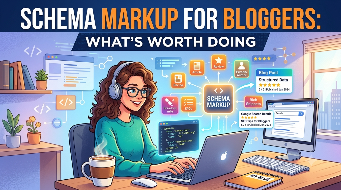
Schema markup is structured code, usually written as JSON-LD, added to a page to explicitly tell search engines what a piece of content represents: this is a recipe, this is a product with a price, this is an article by a specific author published on a specific date. Search engines can often infer a lot of this from the visible page content alone, but explicit markup removes ambiguity and, for certain types, unlocks specific visual treatments in search results known as rich results.

It’s worth separating these two functions clearly, because the events of the past few years have made that distinction matter a great deal. Schema markup as a machine-readable description of your content is one thing. Rich results, the visual dropdowns, star ratings, and expandable panels that markup can sometimes trigger, are a separate thing that Google controls entirely and can remove at will, independent of whether the underlying markup remains valid.

The Big Change: FAQ and HowTo Rich Results Are Gone

For years, FAQ schema was one of the most commonly recommended tactics for bloggers, since it could trigger an expandable question-and-answer dropdown directly under a search listing, giving a result significantly more visual space on the page. As of May 2026, that’s over. Google has fully retired FAQ rich results in search, following a multi-year narrowing that had already restricted the feature to a small set of government and health sites back in 2023. Google is also removing the related Search Console reporting and Rich Results Test support in stages through mid-2026.

This follows the same path How

To rich results took years earlier, when that format was pulled from desktop search entirely back in 2023 and largely lost its remaining relevance since. If you’ve been adding FAQ or HowTo schema specifically to win extra visual space in search results, that specific payoff no longer exists, regardless of how well-implemented the markup is.Importantly, Google has been clear that this is a change to what displays in search, not a penalty against the markup itself. FAQPage remains a valid schema.org type, existing markup won’t cause errors or ranking harm, and other search engines and AI crawlers still parse it. There’s simply no visual reward left for adding it purely for that purpose.

What This Means Practically for a Blogger

If your blog has FAQ schema sitting on pages where the FAQ content is genuinely useful to readers, there’s no urgency to rip it out. Google has said explicitly that unused structured data doesn’t harm a site, so leaving accurate, still-relevant markup in place is a reasonable, low-effort choice. What’s worth reconsidering is adding new FAQ schema purely as an SEO tactic going forward, since the primary reason bloggers adopted it, the SERP dropdown, no longer exists.

The more durable takeaway, echoed across most current coverage of this change, is that the actual value was always in having clear, well-organized question-and-answer content on the page itself, something a reader benefits from and something AI systems can still parse and cite regardless of whether formal schema markup wraps around it. Writing a genuinely useful FAQ section as part of a post’s content remains worthwhile. Adding the JSON-LD wrapper around it purely to chase a rich result that no longer exists is not.

What Still Works and Is Worth Doing

Several schema types continue to produce visible rich results and remain worth a blogger’s time. Article schema, describing a post’s headline, author, publish date, and last-updated date, remains supported and has taken on additional importance as a signal for AI-generated search summaries, which increasingly look for clear authorship and freshness signals when deciding what to cite.

Review and Aggregate

Rating schema, which can produce visible star ratings in search results, remains fully supported and is worth adding to any post that includes a genuine review or rating of a product, book, or service. BreadcrumbList schema, showing a page’s position within your site hierarchy directly in the search result, remains supported and reinforces the kind of site architecture discussed earlier in this series in a way that’s directly visible to searchers.For a blog that publishes recipes, Recipe schema also remains a strongly supported, high-value type, since it’s tied to a rich result format that continues to perform well and gives visible information, like cook time and ratings, that meaningfully influences click-through.

The Pattern Behind Google’s Recent Changes

It’s worth understanding why this happened, since it informs how much to trust any given schema type’s long-term value going forward. Google has been steadily narrowing the set of structured data types that produce visible rich results, retiring several underused or frequently-abused formats over the past few years alongside FAQ and HowTo. The consistent reasoning given is reducing visual clutter and removing formats that weren’t reliably adding value for searchers, rather than any broader retreat from structured data as a concept.This suggests a reasonable working assumption for a blogger deciding where to invest schema effort: types tied to genuinely valuable, differentiated information, like a real product review with a real rating, or a real recipe with real cook times, are more durable bets than types that were mainly being used to win extra screen space regardless of whether the underlying content justified it. Rich results tied to a specific commercial or content value tend to survive these periodic prunings better than ones that became popular mainly as a visibility hack.

Schema and AI Search: A More Careful Claim Than It Sounds

A lot of current advice suggests schema markup, and complete Article schema in particular, helps content get cited in AI-generated search summaries like Google’s AI Overviews. This is worth treating carefully rather than as a settled fact. Google’s own guidance on AI features states there’s no special schema required for AI Overviews or AI Mode specifically, though structured data should still accurately match the page’s visible content. Independent research has also found no clear correlation between schema markup coverage and citation rates across AI platforms, suggesting that clear, well-organized visible content is doing more of the actual work than the markup layer itself.

The more defensible position is that structured data is a low-cost way to make already-good content more clearly machine-readable, not a shortcut that makes weak content perform better in AI-driven search. If a post’s actual content clearly answers a question in plain, well-organized prose, that clarity likely matters more to both traditional rankings and AI citation than whether a JSON-LD block sits alongside it.

A Practical Approach for a Solo Blogger

Given all this, a reasonable schema strategy for most blogs in 2026 is fairly narrow. Add Article schema consistently across posts, since it’s cheap to implement, remains supported, and plausibly helps with both traditional search presentation and AI-driven citation. Add Review schema on any post that includes a genuine product or service review, since the star-rating rich result remains a real, visible benefit. Add Recipe schema if your blog publishes recipes, for the same reason. Beyond that, don’t chase additional schema types purely because a guide recommends them, and don’t feel obligated to remove existing FAQ or HowTo markup that’s otherwise accurate and harmless, even though it no longer earns the visual placement it once did.

The Broader Lesson for This Series

This whole episode is a useful, concrete illustration of a theme that runs through this series more broadly: structural and technical fixes, schema markup included, support good content, they don’t substitute for it. The bloggers least affected by this change were the ones who built genuinely useful FAQ sections as real content in the first place, where the markup was simply a wrapper around something already worth having. The bloggers most affected were the ones who added FAQ schema purely as a tactic, wrapping thin or forced Q&A sections around content that didn’t need that structure, chasing a rich result that’s now gone.

The next post in this series looks at a related diagnostic question: why your bounce rate might be an organization problem rather than a content quality problem, tying structural issues back to a metric most bloggers already track.

Posted on

Header Structure (H1–H3) and Why It Matters for SEO

Search engines do not read content the way humans do. They crawl. They parse. They look for signals that tell them what a page is about and how its ideas connect to one another. Header tags are among the most important of those signals, yet they are often treated as an afterthought, used only to make text bigger or bolder. That is a mistake. When used with intention, headers form the backbone of your content architecture, guiding both search engine crawlers and human readers through your material with clarity and purpose.

The Hierarchy of Meaning

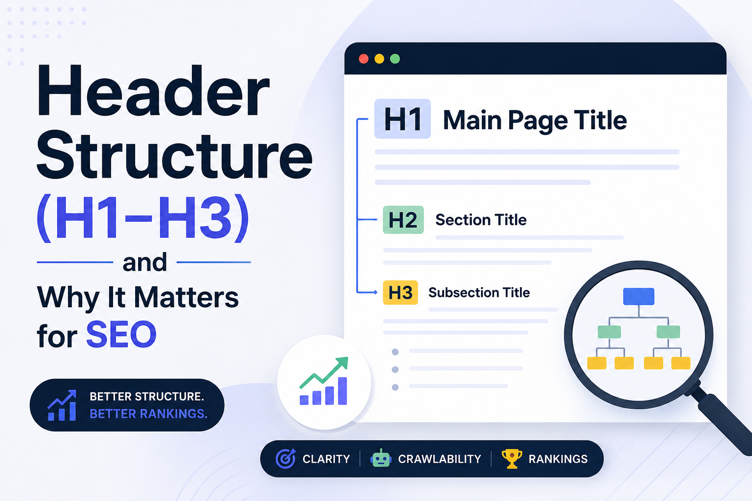
An H1 tag is not simply a title. It is the single most definitive statement of what a page contains. Every page should have exactly one H1, and that H1 should encapsulate the primary topic with precision. Think of it as the headline of a newspaper article. It tells the reader, at a glance, what they are about to learn. For search engines, the H1 carries significant weight in determining relevance. It sits at the top of the semantic hierarchy, and the keywords it contains help algorithms categorize the page correctly. A vague or missing H1 forces search engines to guess your intent, and guessing rarely leads to strong rankings.

Beneath the H1, H2 tags divide the content into its major thematic sections. If the H1 is the book title, the H2s are the chapter headings. Each H2 should introduce a distinct subtopic that supports the central theme established by the H1. This structure allows search engines to understand the relationship between ideas on the page. An H2 about keyword research, for example, signals to a crawler that this section contributes to the broader topic of SEO strategy outlined in the H1. Without H2s, a long piece of content becomes an undifferentiated block of text, and search engines struggle to identify which parts are most important.

H3 tags operate one level deeper. They break H2 sections into smaller, more specific components. If an H2 covers on-page optimization, an H3 might address meta descriptions, image alt text, or internal linking. These tags add granularity. They help readers scan for the precise information they need, and they give search engines additional context about the depth and specificity of your coverage. A page rich in well-structured H3s demonstrates thoroughness, and thoroughness is a quality signal that search engines increasingly value.

Why Structure Influences Rankings

Search engines have evolved far beyond simple keyword matching. Modern algorithms employ natural language processing to understand context, intent, and the relationships between concepts. A clear header hierarchy feeds directly into this capability. When headers cascade logically from broad to specific, algorithms can construct a semantic map of your content. This map helps them match your page to complex, long-tail queries that might not contain your exact keywords but relate closely to your topic. A page about healthy eating that uses H2s for meal planning, nutrient balance, and dietary restrictions, with corresponding H3s beneath each, is far more likely to rank for varied queries than a page that simply repeats the phrase healthy eating in paragraph after paragraph.

User behavior reinforces this structural importance. When visitors land on a page and encounter a wall of text, they tend to leave quickly. High bounce rates and short dwell times send negative signals to search engines, suggesting that the content did not satisfy the user’s need. Headers combat this by making content scannable. A reader can glance at your H2s and immediately know whether the page contains the answer they seek. If it does, they scroll to the relevant H3, find the detail they need, and stay longer. That engagement is measurable, and search engines measure it.

Accessibility adds another dimension to the argument. Screen readers rely heavily on header tags to navigate content for visually impaired users. A logical H1 through H3 structure allows assistive technologies to present information in a meaningful order. Search engines consider accessibility a component of user experience, and pages that serve all users well tend to perform better in search results. Neglecting header hierarchy does not just hurt your rankings, it excludes a portion of your audience.

Common Mistakes That Undermine Structure

One of the most frequent errors is using headers for styling rather than semantics. A writer might choose an H2 because the text looks better at that size, even though the content does not represent a new section. This practice confuses crawlers. If an H2 appears in the middle of a paragraph without introducing a new idea, the algorithm cannot determine where one topic ends and another begins. Always select header levels based on the role the text plays in your argument, not on how it appears on the screen. CSS should handle appearance, headers should handle meaning.

Another mistake is skipping levels. Jumping from an H1 directly to an H3, or using multiple H1s on a single page, breaks the logical flow. It is the equivalent of handing someone a book with two title pages and no chapter headings. The reader, human or algorithmic, loses the thread. Maintain a strict hierarchy. If you need more than three levels of depth, use H4s and beyond, but do so consistently and only when the content genuinely requires that level of subdivision.

Keyword stuffing within headers is equally damaging. Early SEO tactics encouraged loading H1s and H2s with as many keywords as possible, but modern algorithms penalize this behavior. A header that reads unnaturally, packed with variants of the same phrase, reads as manipulation rather than information. Write headers for people first. If your H1 accurately describes the page and your H2s naturally incorporate relevant terms, the SEO value will follow without forced optimization.

Building Content That Earns Authority

Header structure is not merely a technical checkbox. It is a reflection of how well you understand your subject. When you sit down to write, the process of outlining your H1, H2s, and H3s forces you to organize your thoughts. It reveals gaps in your knowledge and highlights where your argument might be weak. A page that flows logically from H1 to H3 is usually a page that has been thought through carefully, and that depth of thought translates into content that other sites want to reference.

Backlinks remain one of the strongest ranking factors, and authoritative sites link to content that demonstrates expertise. A well-structured article is easier to cite because other writers can point directly to a specific H2 or H3 section that supports their own argument. Your headers become anchor points for the broader conversation happening across the web. In this way, strong header architecture does not just help you rank, it helps you become a recognized voice in your field.

The Practical Path Forward

Start every piece of content with an outline. Define your H1 by asking what single question this page answers. Then list the major components of that answer as your H2s. Under each H2, note the specific points that require explanation and assign them as H3s. Only after this skeleton is complete should you begin writing the body text. This discipline ensures that your headers guide the content rather than being retrofitted after the fact.

Review existing pages with an eye toward header hierarchy. Look for pages where the H1 is missing or where multiple H2s could be consolidated or split. Check whether H3s genuinely introduce new ideas or merely restate what the H2 already covered. These audits often reveal quick wins, pages that can climb in rankings with nothing more than structural refinement.

Remember that headers are promises. An H2 promises that the following section will deliver on the idea it names. An H3 promises specificity. When you keep those promises with high-quality, relevant content, you build trust with both your readers and the algorithms that send them your way. That trust compounds over time, turning individual pages into a cohesive, authoritative presence that dominates search results for your niche.

The difference between content that ranks and content that disappears often comes down to the invisible architecture beneath the words. Master your H1 through H3 structure, and you master one of the most powerful, yet most overlooked, tools in modern SEO.

Posted on

What to Look for in a Content Organization Tool

The sheer volume of content we produce and consume daily has turned organization from a nice-to-have into a survival skill. Whether you are managing a personal blog, a marketing department, or a research archive, the tool you choose to structure your work will shape how you think, create, and collaborate. Picking the right one is less about chasing features and more about understanding how you actually work.

Start with the way you capture ideas. The best tools meet you where inspiration strikes, not where you happen to be sitting. A system that forces you to open a specific app, navigate three menus, and tag everything before you can jot down a thought will slowly train you to stop capturing ideas at all. Look for something with low-friction entry points: a quick-add widget, a browser extension, a voice memo that transcribes automatically, or even a simple email-to-inbox feature. The threshold between having an idea and recording it should feel invisible.

Once the ideas are in, they need room to breathe. Rigid folder structures tend to suffocate creativity because they demand that you know exactly what something is before you have fully understood it. A more forgiving approach uses flexible tagging, bidirectional linking, or associative networks that let you connect a piece of content to multiple contexts without duplicating it. This matters because the value of your archive grows not from how neatly it is filed but from the unexpected connections you can draw between seemingly unrelated pieces months or years later.

Searchability is the silent engine of any good system. You will rarely browse for something; you will search for it. If your tool relies on your memory of where you put a file or what you named it, it is already failing you. Full-text search, optical character recognition for images and PDFs, and semantic search that understands synonyms and related concepts are the features that separate a passive storage bin from an active thinking partner. The goal is to find what you need in seconds, not minutes, because every second spent hunting is a second not spent creating.

Collaboration introduces an entirely different set of demands. A tool that works beautifully for one person can become a bottleneck for a team. Shared workspaces, granular permissions, real-time editing, and clear version histories are not luxuries; they are the infrastructure that prevents miscommunication and duplicated effort. Pay attention to how the tool handles conflicting edits, whether it offers comment threads that stay attached to specific content rather than floating in a separate chat, and how gracefully it notifies people without drowning them in noise. The best collaborative tools feel like a shared mind rather than a shared hard drive.

Integration is where a content organization tool either becomes the center of your workflow or an island you constantly have to ferry data to and from. If you live in Google Docs, Slack, Notion, Figma, or a dozen other apps, your organization tool should speak their language. Webhooks, APIs, native integrations, and even simple embed options determine whether your content hub is a source of truth or just another tab competing for attention. The less you have to copy and paste between tools, the more integrity your content retains.

Longevity is an underrated consideration. The tool you choose today is a bet on the future. Startups shut down, acquisition strategies shift, and pricing models change. Open formats, robust export options, and a track record of reliability matter because your content archive is an asset that should outlast any single vendor. If the only way to get your data out is a messy JSON dump or a proprietary file format nobody else reads, you do not truly own your work.

Finally, consider the emotional texture of the tool. This sounds soft, but it is not. You will spend hours looking at this interface. If it feels cluttered, slow, or visually hostile, you will subconsciously avoid it. If it feels calm, responsive, and thoughtfully designed, you will gravitate toward it. The best content organization tools do not just store your work; they invite you back in. They make the act of organizing feel like part of the creative process rather than administrative drudgery.

Choosing a content organization tool is ultimately an act of self-knowledge. It requires honesty about your habits, your team’s dynamics, and the kind of thinking you want to enable. The right tool will not do the thinking for you, but it will clear the path so that your best ideas have space to grow, connect, and endure.

Posted on

How to Do a Competitor Content Analysis

The first thing to understand about competitor content analysis is that it is not about copying what others are doing. It is about understanding the landscape so you can find your own space within it. Every market has noise, and every audience has fatigue. Your job is to figure out where the gaps are, what your competitors are missing, and how you can serve your audience in a way that no one else currently does. This process requires patience, honesty, and a willingness to look at your own work with the same critical eye you turn toward everyone else.

Start by identifying who your real competitors are. This sounds obvious, but most people get it wrong. Your competitors are not just the big names in your industry or the websites that rank above you for your favorite keywords. Your competitors are anyone creating content that satisfies the same audience need you are trying to satisfy. That might include a solo blogger with a small but loyal following, a YouTube channel, a newsletter, or even a community forum where your target audience hangs out and finds answers. Make a list that is broad at first. You can always narrow it later, but if you start too narrow, you will miss the peripheral players who are often the most innovative because they have nothing to lose.Once you have your list, choose a manageable number to study deeply. Three to five is usually enough for a thorough analysis, though you might scan a larger pool to spot trends. For each competitor, spend real time with their content. Do not just skim headlines. Read full articles, watch videos, listen to podcasts, and subscribe to their emails. You are trying to understand their voice, their depth, their frequency, and their strategy. Take notes on what they cover and what they ignore. Notice the questions they answer and the ones they leave hanging. Pay attention to the comments sections and social shares, because these reveal what resonates and what falls flat.

As you immerse yourself in their work, begin to categorize their content by type, topic, and intent. Some content is designed to attract new audiences through search engines, while other pieces are meant to nurture existing relationships or convert readers into buyers. Notice the ratio between these types. A competitor who publishes mostly top-of-funnel educational content might be building authority but struggling to monetize. A competitor who publishes mostly product-focused content might have a loyal audience but limited reach. Neither approach is wrong, but understanding the balance helps you see where you might differentiate.

Next, evaluate the quality of what they are producing. Quality is subjective, but there are concrete markers you can assess. Look at the research depth. Are they citing sources, sharing original data, or relying on regurgitated opinions? Look at the production value. Is their writing clear and edited, or rushed and error-filled? Are their visuals professional, or do they look like afterthoughts? Look at the originality. Are they saying something new, or are they echoing the same talking points everyone else uses? Be brutally honest in this assessment, because your audience is making these same judgments about your work whether you realize it or not.

Now examine their distribution and promotion strategy. Great content that no one sees is not really great content, it is just a private journal entry. Notice where your competitors share their work. Are they active on specific social platforms? Do they have an email list, and if so, how often do they send to it? Do they guest post on other sites? Do they repurpose content across formats? Look at their backlink profile using any available tools to see who is linking to them and why. This tells you not just where their traffic comes from, but who considers them authoritative enough to reference. It also reveals partnership opportunities you might pursue.

Pay special attention to the engagement their content generates. A blog post with thousands of views but zero comments suggests the content is forgettable. A podcast with a small download number but an active community discussing every episode suggests deep resonance. Look at what people are saying in the comments, on social media, and in reviews. The language your competitor’s audience uses is incredibly valuable because it reveals how they think about their problems and what they wish someone would address. Sometimes the most insightful part of competitor analysis is not the competitor’s content itself, but the conversation happening around it.

With all this information gathered, look for patterns and gaps. Patterns show you what the market expects and what has been proven to work. Gaps show you where the opportunity lies. Maybe every competitor in your space writes long-form guides but no one produces quick reference tools. Maybe they all focus on beginners and ignore advanced practitioners. Maybe they cover tactics but never strategy, or they discuss theory without showing real implementation. These gaps are not just opportunities for content ideas, they are opportunities for positioning. When you consistently fill a gap that others leave open, you become known for something specific, and specificity is what builds a loyal audience.

Do not forget to analyze yourself with the same rigor. It is easy to see what competitors do poorly and assume you are doing better, but that assumption is dangerous. Audit your own content through the same lens. Where do you fall short on depth, originality, or consistency? Where are you repeating the same themes without advancing the conversation? The goal of competitor analysis is not to make you feel superior, it is to make you sharper. The best practitioners in any field know exactly where they stand relative to everyone else, and they use that knowledge to improve rather than to boast.

Finally, turn your analysis into action. Create a document that summarizes your findings, but do not let it become a dusty report no one reads. Use it to inform your editorial calendar. Use it to guide your positioning. Use it to set benchmarks for your own quality and frequency. Revisit it every quarter because content landscapes shift quickly. A competitor who was dominant last year might have grown complacent. A new voice might have emerged with fresh energy. The analysis is never truly finished because the market is never truly still.

The ultimate measure of a good competitor content analysis is whether it changes what you create and how you create it. If you finish the process and your content strategy looks exactly the same as before, you have wasted your time. But if you finish with a clearer sense of where you fit, what you can offer that no one else does, and how to communicate that difference with excellence, then you have done the work properly. The internet does not need more content. It needs better content, created by people who understand their audience deeply enough to matter. Competitor analysis is one of the most reliable paths to that understanding.

Posted on

Why Your Bounce Rate Might Be an Organization Problem

Every digital marketer has stared at the bounce rate metric with a particular kind of dread. It sits there in the analytics dashboard, a single red number that seems to accuse you of failure. A visitor arrived, looked around, and left. No second click. No scroll. No conversion. The instinctive response is to blame the landing page. The headline was weak. The hero image was stock. The call-to-action button was the wrong shade of blue. Teams scramble to A/B test headlines, swap out images, and tweak button colors, chasing the elusive percentage point that will turn a bounce into a stay. But what if the problem is not on the page at all? What if your bounce rate is not a design flaw or a copy failure, but a symptom of something deeper and more structural, something that lives in the hallways and meeting rooms of your organization rather than in the pixels of your website?

Consider what a bounce actually represents. A person, somewhere in the world, had a need or a curiosity. They typed a query into a search engine or clicked a link from an email or a social post. They arrived with an expectation, however faint, that your site would satisfy that need. Within seconds, they decided it would not. The decision was made faster than most people can choose what to eat for lunch. This is not a failure of patience on the visitor’s part. It is a failure of alignment on yours. The gap between what the visitor expected and what they found is where bounces are born, and that gap is often created long before the visitor ever loads the page.In many organizations, the team that writes the ad copy does not talk to the team that designs the landing page. The social media manager crafts a compelling post that promises insight, entertainment, or a solution, and the traffic flows in. But the landing page was built by a different team, with different priorities, perhaps weeks or months ago. It was optimized for a different campaign, a different message, a different audience segment. The visitor clicks through expecting a seamless continuation of the story they were told, and instead they find a jarring shift in tone, design, and promise. The cognitive dissonance is instant and fatal. They bounce not because the page is bad, but because it is the wrong page for the promise that brought them there. This is an organizational failure masquerading as a user experience failure.

The same fracture can appear between search engine optimization and content strategy. An SEO team, driven by traffic targets and keyword rankings, optimizes pages to capture high-volume search queries. They succeed. The traffic arrives. But the content team, working on an editorial calendar set months in advance, has not produced the depth or specificity that someone searching for that query actually needs. The page ranks for the keyword, but it does not answer the question. The visitor lands, scans, realizes the mismatch, and leaves. The SEO team celebrates the ranking. The content team laments the engagement. The analytics team reports the bounce. No one connects the dots because no one owns the entire journey. The organization is siloed, and the bounce rate is the smoke rising from the walls between departments.

Even the technology itself can be an organizational symptom. Slow load times, broken layouts on mobile devices, intrusive pop-ups that obscure the content, these are not merely technical bugs. They are the result of prioritization decisions made in conference rooms. The engineering team is understaffed because the budget went to marketing. The mobile experience is neglected because the executive team still does most of their browsing on desktop computers. The pop-up exists because the lead generation team has a quarterly target that overrides the user experience team’s warnings. Every technical friction point that drives a bounce was once a decision made by people with competing incentives, reporting to different managers, measured by different key performance indicators. The bounce rate is the visitor’s verdict on those internal conflicts.

There is also the deeper issue of organizational self-awareness. A high bounce rate can indicate that the company does not actually know who it is talking to. The marketing department may have built elaborate personas, but if the product team has never met a real customer, and the customer service team does not share what they hear in support tickets, and the sales team keeps its insights in a private spreadsheet, then the personas are fiction. The website speaks to an imagined audience, and the real audience, arriving with real needs, finds no one addressing them. They bounce because the organization, for all its internal activity, has not managed to become a single coherent voice that recognizes the person on the other side of the screen.Fixing this requires a different kind of audit than the one most teams perform. Instead of testing button colors, test the handoffs. Map the journey of a visitor from the first touchpoint to the landing page, and identify every organizational boundary they cross. Does the promise made in the email match the headline? Does the social post’s energy survive the transition to the website’s more corporate tone? Does the search result’s description accurately reflect the content behind it? These are not creative questions. They are structural ones. They require people who do not normally sit in the same meetings to look at the same data and agree on what it means.

It also requires a rethinking of what the bounce rate is actually measuring. It is not a scorecard for the landing page alone. It is a measure of organizational coherence. A low bounce rate means that the left hand knows what the right hand is doing, that the promise and the fulfillment are in conversation, that the company has managed to present itself as a unified entity rather than a collection of competing fiefdoms. A high bounce rate, conversely, is often the first visible sign that the organization has become fragmented, that different teams are optimizing for different outcomes without regard for the whole, and that the customer is falling through the cracks between those optimizations.

The uncomfortable truth is that some bounce rates cannot be fixed by a better headline or a faster server. They can only be fixed by better alignment. By teams that talk to each other not just in quarterly reviews but in daily practice. By metrics that reward the entire journey rather than individual handoffs. By leadership that understands a visitor does not experience a company in departmental slices but as a single, continuous impression. When that impression is fractured, the visitor leaves. Not because they are impatient, not because they are fickle, but because they can sense, even in the first few seconds, that no one is really home. The lights are on, but the house is empty.

So the next time you gather around the analytics dashboard and stare at that red number, resist the urge to reach for the nearest design tool. Instead, ask a harder question. Ask whether your organization is arranged in a way that makes a coherent experience possible. Ask whether the person who wrote the promise and the person who built the destination have ever truly collaborated. Ask whether your teams are measured on the same definition of success. The bounce rate might not be telling you that your page is broken. It might be telling you that your organization is.

Posted on

How to Evaluate ROI on a One-Time SEO Tool Purchase

A one-time purchase feels simpler to evaluate than a subscription, since there’s no recurring bill to weigh month after month. In practice, that simplicity is a little misleading. A one-time SEO tool still needs to earn back its cost, and the way to think about that payback is different from how you’d evaluate a subscription, precisely because there’s no ongoing bill forcing you to reassess the decision every month.This post covers a practical way to think through whether a specific one-time purchase is actually worth it, using the kind of BYOK content organization tool discussed earlier in this series as a running example.

Start With What the Tool Actually Replaces

Before thinking about cost at all, get clear on what the tool is standing in for. If it replaces an afternoon of manual work you’d otherwise do yourself, following something like the manual audit process covered earlier in this series, the honest comparison is the tool’s price against the value of your own time saved, not against some abstract sense of “is this worth it.” If you’d have spent four hours doing something manually and the tool does it in twenty minutes with comparable quality, that’s four hours of your time recovered, and it’s worth putting a real number on what your time is worth before deciding whether the price is reasonable.If the tool replaces an ongoing subscription you’d otherwise be paying monthly, the comparison is more directly financial: total up what a year or two of the subscription alternative would cost, and compare that against the one-time price.

Factor In Your Own Usage Costs, Not Just the Purchase Price

For a BYOK tool specifically, the purchase price isn’t the whole cost. As covered earlier in this series, using a bring-your-own-key tool means you’re also paying for the underlying model’s API usage directly, separate from what you paid for the tool itself. A fair ROI calculation includes a rough estimate of what a typical audit or run actually costs in API usage, not just the one-time license fee, since the two together are your real total cost of ownership.For a content organization tool doing something like a full-site audit, this usually means estimating roughly how many tokens a scan of your site’s content would use, at current model pricing, and adding that to the purchase price when comparing against alternatives. It’s a modest additional cost in most cases, but it’s worth actually estimating rather than assuming the one-time price is the entire financial picture.

Think in Terms of Runs, Not Just a Single Use

A tool you use exactly once has a straightforward ROI calculation: did that one use save you more value than the price. But most tools of this kind are used repeatedly over time, an initial full audit followed by periodic smaller re-checks as your blog grows. The realistic ROI calculation should account for how many times you expect to actually use the tool over a reasonable ownership period, say a year or two, since a tool used a dozen times has a very different cost-per-use than one used once and forgotten.

This is also where BYOK models can look particularly favorable compared to a subscription: since there’s no recurring license fee, using the tool ten times over a year costs you the same purchase price plus ten runs’ worth of API usage, rather than twelve months of subscription fees regardless of how often you actually opened the tool.

Compare Against Doing Nothing, Not Just Against Alternatives

It’s easy to frame an ROI decision purely as “this tool versus a competitor’s tool,” but the more honest baseline is often “this tool versus continuing to operate without any structured process at all.” If your blog currently has orphaned posts, duplicate content, and no clear cluster structure, and you know from earlier posts in this series what that costs in lost traffic and reader engagement, the relevant comparison includes the ongoing cost of that disorganization continuing indefinitely, not just the sticker price of a tool that might fix it.

This framing tends to make a modest one-time purchase look more favorable than a narrow “tool versus tool” comparison would suggest, provided the tool genuinely addresses a real, current problem on your site rather than one you don’t actually have.

Be Honest About Whether You’ll Actually Use It

The best ROI math in the world doesn’t matter if a tool sits unused after purchase. Before buying anything, it’s worth being honest about your own habits: do you actually tend to follow through on structural projects like a content audit, or does this kind of work tend to get pushed aside indefinitely in favor of writing new content instead. A tool that makes an existing habit faster is a much safer bet than a tool you’re hoping will create a habit you don’t currently have.

A Simple Framework to Apply

Putting this together, a reasonable way to evaluate any specific one-time SEO tool purchase is to estimate the time or subscription cost it genuinely replaces, add your best estimate of ongoing usage costs if it’s a BYOK tool, multiply by how many times you realistically expect to use it over a year or two, and compare the total against the price, while being honest with yourself about whether you’re actually likely to use it at all based on your own track record with similar tools in the past.None of this needs to be a precise spreadsheet exercise. Even a rough version of this thinking, done for five minutes before a purchase, tends to catch the most common mistake in evaluating one-time tools: focusing entirely on the sticker price while ignoring both the ongoing usage cost and the realistic frequency of use that determines whether that price is actually a bargain or an expensive way to solve a problem you’d have fixed manually in an afternoon anyway.

The next post in this series looks at a related question from the other side of the purchase decision: signs you’ve outgrown spreadsheet-based content tracking, and when the manual process itself starts costing more than a dedicated tool would.

Posted on

How Long Should a Blog Post Be in 2026

The question of ideal blog post length has haunted content marketers for over a decade, and in 2026 the answer remains as unsatisfying as ever: it depends on what you are trying to accomplish, who you are trying to reach, and what the people reading your work actually need from you. The internet is littered with studies claiming that two thousand words is the magic number, or that three thousand words ranks better, or that short posts under six hundred words perform best on social media. All of these claims capture something true about specific contexts, and all of them fail when applied universally. The length of your blog post should be determined by the depth of the topic and the intent of your reader, not by an arbitrary word count target you read in a headline.

Google has never published an official word count requirement, and its representatives have consistently said that content length is not a direct ranking factor. What the algorithm actually measures is satisfaction, whether the person who clicked your link found what they were looking for and whether they stayed to consume it or bounced back to the search results to try something else. A two-hundred-word answer that perfectly resolves a simple question can outrank a three-thousand-word opus that buries the solution under paragraphs of fluff. Conversely, a complex topic that genuinely requires deep exploration will struggle to satisfy readers if it is compressed into a superficial overview. The algorithm has become sophisticated enough to distinguish between brevity that serves the reader and brevity that results from laziness.

In 2026, the most successful content strategies are moving away from uniform length requirements and toward intent-based length decisions. Informational queries that ask a straightforward question often deserve a straightforward answer. A post explaining what a 401k is does not need to be a definitive treatise on retirement planning. It needs to define the term clearly, explain how it works in practical terms, and point the reader toward next steps if they want to go deeper. Forcing this into two thousand words does not add value. It adds friction. The reader who wanted a quick answer now has to scroll through sections they did not ask for, and the algorithm notices when they leave unsatisfied.

On the other hand, commercial investigation queries demand depth because the reader is making a decision with consequences. Someone comparing project management software for a fifty-person team is not looking for a surface-level listicle. They want detailed feature comparisons, pricing breakdowns, integration capabilities, security considerations, and honest assessments of strengths and weaknesses. This content naturally runs longer because the topic requires it. The length is not padding. It is the necessary architecture of a useful resource. Posts in this category often land between two thousand and four thousand words, not because of a word count target, but because that is how much space it takes to do the topic justice.

The rise of AI-generated content has complicated the length question in ways that were not fully apparent even a few years ago. Large language models can produce thousands of words in seconds, and many content teams have responded by publishing longer posts more frequently, assuming that volume and length will overwhelm the competition. This strategy is already showing signs of collapse. Readers are developing fatigue for bloated articles that say very little. The algorithm is improving at detecting content that repeats the same points in different words, adds irrelevant sections to hit a word count, or structures information in ways that prioritize length over clarity. In 2026, the content that wins is not the longest. It is the most complete relative to the specific need it serves.

Another shift worth noting is the growing importance of multimedia in determining effective content length. A blog post that includes a detailed video tutorial, an interactive calculator, or a downloadable template does not need to be as text-heavy to deliver value. The words on the page are one component of a larger experience. A fifteen-hundred-word post paired with a ten-minute video walkthrough may deliver more practical value than a four-thousand-word post with no visual aids. When measuring length, forward-thinking content teams are starting to measure time-to-value rather than word count. How long does it take for the reader to get what they came for, and does the total time investment feel proportional to what they receive?

The platform where your content lives also influences length expectations. A blog post discovered through organic search can afford to be longer because the reader arrived with specific intent and is willing to invest time. The same content shared on LinkedIn or Twitter may need to be excerpted, summarized, or restructured because social audiences are browsing, not searching. Email newsletters sit somewhere in between, with subscribers generally tolerating longer reads if the subject line promised depth and the opening paragraphs deliver on that promise. The mistake is publishing one version everywhere and expecting it to perform equally. Length should flex to fit the context of consumption.

There is also the practical reality of production constraints. A small team or solo creator cannot sustainably publish three-thousand-word posts multiple times per week without sacrificing quality or burning out. The content calendars that dominate in 2026 are not built around maximum length. They are built around sustainable consistency. A weekly twelve-hundred-word post that is genuinely useful will outperform a monthly four-thousand-word post that exhausts the creator and arrives irregularly. Your content length should be something you can maintain without compromising the rest of your business. A blog that publishes nothing for three months because the team is chasing an arbitrary word count loses more ground than it gains.

The most honest answer to how long a blog post should be in 2026 is that it should be exactly as long as it needs to be and no longer. Start with the reader’s question. Determine what a complete, satisfying answer looks like. Write that. Then edit ruthlessly, removing anything that does not serve the reader’s journey from confusion to clarity. If the result is eight hundred words, publish it with confidence. If the result is three thousand words, make sure every paragraph earns its place. The algorithm does not reward length. It rewards satisfaction. And satisfaction is measured in the reader’s experience, not in your word processor’s status bar.

Posted on

Understanding Search Intent Before You Write

Every piece of content that fails to rank, fails to convert, or fails to engage has at least one thing in common: it was written without a clear understanding of why the reader was searching in the first place. Search intent is the invisible force behind every query typed into a search engine, and ignoring it is the fastest way to waste time, energy, and opportunity. Before you write a single word, you need to know what the person on the other side of the screen is actually trying to accomplish.

Search intent falls into four broad categories, but the boundaries between them are softer than most guides suggest. Informational intent covers the vast landscape of people who want to learn something, know something, or understand something. They are not looking to buy, at least not yet. They want answers, explanations, definitions, or tutorials. Navigational intent is what drives someone who already knows where they want to go and uses the search engine as a map. They type a brand name, a specific website, or a login page because it is faster than typing the full URL. Transactional intent belongs to the ready buyer, the person with credit card in hand who wants to purchase, subscribe, or hire right now. Commercial investigation sits in the messy middle, where the searcher is comparing options, reading reviews, and weighing decisions without being quite ready to commit.

The mistake most writers make is assuming that the keyword itself tells the whole story. It does not. Someone searching for “best running shoes” is almost certainly in commercial investigation mode. They want comparisons, reviews, and enough detail to feel confident in a choice. Someone searching for “Nike Air Zoom Pegasus 39” is likely navigational or transactional, they already know the product and are either looking for the official page or the best place to buy it. Someone searching for “how to choose running shoes” is informational, they are early in the journey and need education before they can even think about a purchase. The same broad topic, three entirely different mindsets, and three entirely different content approaches required.

Google has become exceptionally good at reading intent, and it judges your content against what it believes the searcher wants. If the top results for a query are all detailed buying guides with comparison tables and pros and cons lists, and you publish a five-hundred-word overview that barely skims the surface, you are not going to rank no matter how well you optimize your title tags. The algorithm has already learned that people who type that phrase want depth, detail, and decision-making support. Your thin content signals that you do not understand the assignment.

This is why studying the search results page before you write is non-negotiable. Do not just glance at the titles. Open the top five results and read them. Ask yourself what they all have in common. Are they long-form articles or short answers? Do they include images, videos, or tools? Are they written for beginners or experts? Is the tone formal or conversational? The patterns you see are not accidents. They are the accumulated data of millions of searches, and Google has decided that this particular mix of content best satisfies the people asking this particular question. Your job is not to copy what is there but to understand the underlying need and meet it more completely than anyone else has.

Intent also changes over time, and the same keyword can shift meaning as culture, technology, and events evolve. A search for “mask” in 2019 would have returned results about Halloween costumes and skincare routines. By mid-2020, the intent had shifted almost entirely to health and safety. A search for “remote work tools” before the pandemic might have served a niche audience of digital nomads and distributed startups. Now it serves a global workforce. If you are relying on old keyword research or outdated assumptions about what a term means, you are writing for an audience that no longer exists.

The format of your content is as much a part of satisfying intent as the words themselves. Someone with informational intent might be perfectly happy with a well-structured blog post, but they might be even happier with a video tutorial or an interactive tool that lets them explore the concept at their own pace. Someone in commercial investigation mode wants comparison charts, detailed specifications, and honest pros and cons. They do not want a sales page disguised as a review. Someone with transactional intent wants a clean, fast, trustworthy path to purchase. Friction is the enemy. Every unnecessary click, every vague product description, every hidden shipping cost is a reason to abandon the process and go back to the search results.

Understanding intent also means understanding where your content fits in the broader journey your audience is taking. The person reading your informational guide on retirement planning today may become the person searching for a financial advisor six months from now. The parent researching developmental milestones this week may be looking for pediatric specialists next month. Your content should serve the immediate intent without closing the door on future intent. This is why the best content does not just answer the question at hand but anticipates the next logical question and provides a path forward.

There is a temptation to treat search intent as a box to check, something to verify quickly before moving on to the more exciting work of writing. This is backwards. Intent is the foundation. It determines your angle, your depth, your tone, your format, and even your call to action. A blog post written without intent in mind is like a speech written without knowing who is in the audience. You might deliver beautiful sentences, but they will land on ears that are waiting for something else entirely.

The writers and marketers who consistently outperform their competition are not necessarily better writers. They are better listeners. They listen to what the search results are saying about what people want. They listen to the questions customers ask in support emails and sales calls. They listen to the language people use in forums and social media, which is often very different from the polished keywords in their editorial calendars. This listening is what allows them to create content that feels inevitable, the exact right answer at the exact right moment.

Before you write your next piece, pause. Type your target keyword into Google and spend twenty minutes with the results. Read the top pages carefully. Scroll through the related searches and the people also ask boxes. Look at the images and videos that appear. Ask yourself what is missing, what is overdone, and what the searcher is really hoping to find. Then write something that makes them feel understood. That is the only optimization that has ever mattered.

Posted on

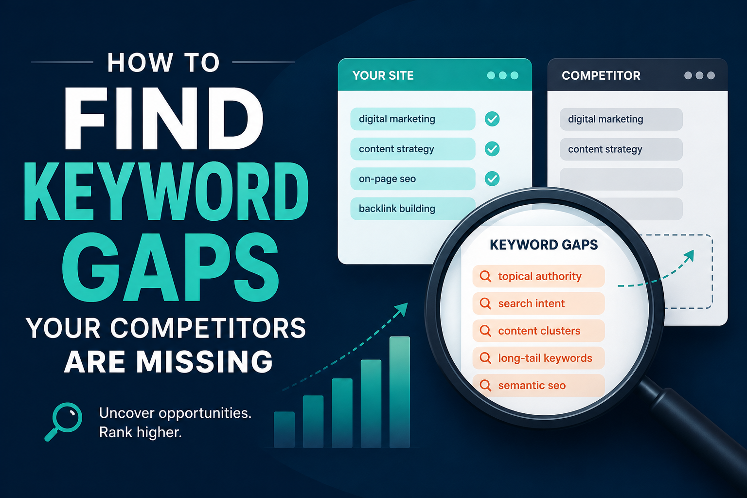
How to Find Keyword Gaps Your Competitors Are Missing

Every website owner dreams of ranking on the first page of Google, but most spend their time chasing the same crowded keywords everyone else is already fighting over. The real growth happens in the shadows, in the spaces your competitors have overlooked or ignored entirely. These are keyword gaps, and finding them is the closest thing to a shortcut in search engine optimization.

A keyword gap is simply a search term that your competitors rank for but you do not, or more valuably, a term that nobody in your niche is targeting at all. These gaps represent unclaimed territory, audiences searching for answers that no one is providing well. The businesses that learn to spot and fill these gaps consistently outrank larger, better-funded competitors who are too busy optimizing for the obvious terms.

The first place to look for these opportunities is in the long tail. Most people instinctively gravitate toward short, high-volume keywords because the traffic numbers look impressive on paper. A term like “running shoes” might get fifty thousand searches a month, but it is also being chased by every major athletic brand and publication on the internet. Meanwhile, “best running shoes for flat feet and high arches” might only get a few hundred searches, but the person typing that query knows exactly what they want and is much closer to making a purchase. The competition for that phrase is often nonexistent, and there are thousands of these specific variations hiding in plain sight. Start by thinking about the problems your audience actually faces, not the broad categories they belong to. What questions do they ask in support emails? What objections do they raise before buying? Each of these is a potential keyword gap waiting to be filled.

Another rich source of overlooked keywords lies in the comparison and versus space. Searchers love to compare options before making a decision, yet most businesses avoid creating content that mentions their competitors by name. They fear it will drive traffic away or appear unprofessional. This fear creates a massive gap. When someone searches for “your product versus competitor product” or “alternative to popular tool,” they are already deep in the buying process. If you are the only one providing a thorough, honest comparison, you control the narrative. You do not need to trash your competitors, you simply need to be the most helpful voice in the room. Review sites and forums often rank for these terms by default, not because they are the best answer, but because nobody else bothered to write the content.

Seasonal and trending topics represent another category of keyword gaps that move too quickly for most competitors to catch. A sudden shift in regulations, a new technology announcement, or a cultural moment can create a surge of searches before the established players in your industry have time to react. The key is to build a system for monitoring these shifts rather than relying on luck. Set up alerts for industry news, follow the discussions happening in niche communities, and pay attention to what your audience is suddenly asking about on social media. The first few pieces of content published during the early wave of interest often retain their rankings long after the trend becomes mainstream, simply because they were there first and have accumulated backlinks and engagement.

Your competitors’ own content can also reveal what they are missing. Take the time to actually read the articles and pages that rank well in your space, not just scan them for optimization cues. Look for the questions they raise but do not answer fully, the assumptions they make that leave beginners behind, and the outdated information they have not updated. If a top-ranking post mentions a concept in passing but does not explain it, that is a gap. If they use technical jargon without defining it, that is a gap. If their guide skips a step that a real beginner would need, that is a gap. Your goal is not to copy what they have done but to complete what they have left unfinished.

The search results themselves are a map of intent that most people read too quickly. When you type a query into Google, look at what is already ranking and ask yourself what is missing from the page. Are the results all listicles when someone is clearly looking for a tutorial? Are they all product pages when the searcher is still in the research phase? Are they all text when a visual explanation would be far more useful? Google is trying to satisfy intent, and when the current results do a poor job, it is actively looking for something better. A keyword gap is not always about finding a term no one has written about, sometimes it is about finding a term that everyone has written about poorly.

Voice search and conversational queries have opened up entirely new categories of gaps that traditional keyword research tools struggle to capture. People speak to their devices differently than they type into a search bar. They ask full questions, use natural language, and include location and context that they would never type. A typed search might be “emergency plumber Chicago,” but a voice search is “who is the best emergency plumber near me that is open right now.” These longer, more specific phrases have lower search volume individually, but they add up to significant traffic and almost always indicate higher intent. The businesses that optimize for how people actually talk, rather than how they type, are finding gaps that their competitors do not even know exist.

Do not overlook the value of zero-search-volume keywords. Many SEO professionals filter these out automatically, assuming that if a tool reports no monthly searches, there is no opportunity. This is a mistake. Keyword research tools estimate search volume based on samples and models, and they are particularly bad at capturing new, emerging, or hyper-specific queries. If a term perfectly describes a problem your audience has, and you know from conversations with customers that people are asking about it, write the content anyway. You will often find that the real search volume is higher than the tools suggest, and even if it is not, ranking for a term with no competition gives you a foothold in a topic area that may grow over time.

The most powerful keyword gaps are often found at the intersection of two unrelated topics. When you combine your core expertise with an adjacent field, you create content that serves an audience that no one else is addressing. A fitness coach who writes about productivity for entrepreneurs, a financial advisor who covers mental health and money, a web designer who focuses on accessibility for nonprofits, these intersections have less competition because they require expertise in two areas, and most competitors only have one. The audience at these crossroads is often highly engaged because they have been searching for content that speaks to their specific situation and finding nothing.

Finally, remember that finding keyword gaps is not a one-time project. The search landscape shifts constantly. Competitors publish new content, algorithms change, and audience behavior evolves. The businesses that treat keyword gap analysis as an ongoing practice, rather than a checklist item during a site launch, are the ones that continue to find new opportunities while everyone else is fighting over the same shrinking pool of obvious terms. The gaps are always there, but they move. Your job is to keep looking.